Results 1 to 10 of 10

Flyer design help

| General - Let's talk business
  1. #1
    weeeben started this thread.
    SMF Badges of Honor


    Member since
    Sep 2013
    Posts
    67
    Thanks
    8
    Thanked 18 Times in 10 Posts

    Flyer design help

    Hi all, I was wondering if there were any scrappers here that had a good eye for design?
    in particular, e-waste collectors, I just wanted some tips as to what else I can put on my flyer.

    I have two flyers, one for advertising to businesses and one for residential homes.
    the one that I want to fix is the business flyer, I was just starting out and was in a rush to give the designer an idea.
    so I just came up with a couple lines on the front, Free pick-up service & Free data destruction as that's what I thought was most important
    to companies wanting to recycle e-waste.

    i'm happy with my logo, the colors and my biz' name, I blanked out my name & phone # so it wouldn't appear i'm trying to get free advertising
    this flyer is printed in A5 size, so it's quite big and just feels empty and doesn't quite do it for me, I prefer the back so I usually hand it with the back facing up
    when i'm doing a face to face or staple my card to it which makes it seem more, mostly I distribute them through letterbox walks or leave them at reception.

    This is the front, what can we do here?


    I only got 1000 of 'em printed so I need more but before I go for a bigger print run, I want to fix it.
    what can I put on the front? i'm thinking data destruction should go? when I hand it to a receptionist, they don't seem to catch on what it's about real quick,
    i'd like them to see it and get an instant thought that it's about electrical equipment.

    This is the back, there's a bit more here, the idea for the back is when i'm picking up from an office, I hand a flyer to the receptionist, then as i'm picking up things, walking in and out
    with the trolley, i'm hoping they are reading my flyer and it gives them more ideas, they might remember the broken coffee machine, kettle or think of something else.


    Anything else I can do to the back?
    I'd really appreciate some ideas or examples I could get ideas from, thanks!

    I got this star from planet ark which I can use, maybe that could go on the fback, in between my name & the plugs?


    This is my residential flyer for comparison, I did this this flyer later on, it's size is DL, the letterbox size so it's more compact and seems filled up.
    as you can see, I charge residential homes a $10 pick-up fee, most calls are inspired by peoples need to get rid of their old crt's, the $10 covers the extra effort needed to recycle right.
    well, id say it balances out in the long run, sometimes I don't charge 'cos the pick up is so good, other times I can spend an hour picking up one crt that the owner was sure it was in the garage somewhere!

    Residential front..


    Residential Back..


    The only issue I might have with this flyer is a lot of calls ask whether it's $10 per item or $10 for everything.
    I understand most are probably just making sure, but maybe I should make that more clearer next time round?


  2. #2
    sawmilleng's Avatar
    SMF Badges of Honor


    Member since
    Feb 2013
    Location
    Central Kootenays, BC, Canada
    Posts
    861
    Thanks
    713
    Thanked 1,200 Times in 521 Posts
    The only detail I noticed was "keeping toxic e-waste from local landfill". Taking off my scrapper hat for a minute and putting on my "joe average consumer" hat, I would say that dumping my computer in the landfill isn't THAT toxic. The word cheapens an otherwise very well thought out page.


    Just my $0.02.

    Jon.

  3. The Following User Says Thank You to sawmilleng for This Post:


  4. #3
    weeeben started this thread.
    SMF Badges of Honor


    Member since
    Sep 2013
    Posts
    67
    Thanks
    8
    Thanked 18 Times in 10 Posts
    Yeah I guess if you compare others things like chemicals ect, a computer doesn't appear to fit into that category.
    I'll think up another word for next time, that flyer is my residential, i'm circulating them now so can't change until next print.

    but it's the top one that i'm trying to fix, trying to be a bit more effective with my biz' to biz' advertising.

  5. #4
    Premiercorerecycling's Avatar
    SMF Badges of Honor


    Member since
    Oct 2012
    Location
    Bradenton, FL
    Posts
    41
    Thanks
    0
    Thanked 19 Times in 7 Posts
    This is our flyer/mailer we use

    [IMG][/IMG]

  6. The Following User Says Thank You to Premiercorerecycling for This Post:


  7. #5
    SMF Badges of Honor


    Member since
    Feb 2012
    Location
    OK
    Posts
    5,731
    Thanks
    6,815
    Thanked 3,465 Times in 1,990 Posts
    funny thing is the very word they've always used to identify PCBs (printed circuit boards), was/is as them being "toxic waste", which was/is not wanted in our landfills. Maybe next time you can manufacture a new term everyone would know ; )
    The only thing that looks "cheap" to me is the $10 flat pick-up fee
    Last edited by Bear; 09-29-2013 at 09:57 PM.

  8. The Following User Says Thank You to Bear for This Post:


  9. #6
    weeeben started this thread.
    SMF Badges of Honor


    Member since
    Sep 2013
    Posts
    67
    Thanks
    8
    Thanked 18 Times in 10 Posts
    really? you mean it looks cheap and trashy? or it looks cheap in cost?
    I think you mean it cheapens the flyer, I don't know, I have to put the price up as they'd all be calling for price.
    it's hard to manage a phone, taking bookings and picking up at the same time, so I couldn't handle just queries.
    the general response I get from customers is why so cheap? they almost fell over reading it, thinking i'm going for that deal.
    initially it was going to be $5, I only target my district with residential, i'm even picking up in the same street on the day,
    I usually feel guilty taking the money.

    PCR, That's a great flyer, thanks for posting it up, it's my understanding that people like to read, I think your flyer is well described.
    the pictures of e-waste give it a more professional feel, you only need to look at them and realise what's going on here.
    i'm jealous of your drop off location, that's my next step, but we have laws here that prevent recycling & public drop off facilities being together.

  10. The Following User Says Thank You to weeeben for This Post:


  11. #7
    SMF Badges of Honor


    Member since
    Feb 2012
    Location
    OK
    Posts
    5,731
    Thanks
    6,815
    Thanked 3,465 Times in 1,990 Posts
    well, i made that statement before seeing the whole string of photos, thought it to be on the commercial ad. $10 be about right on residential p/u's i guess. I wasn't trying to imply your ad looked cheap at all man

  12. #8
    weeeben started this thread.
    SMF Badges of Honor


    Member since
    Sep 2013
    Posts
    67
    Thanks
    8
    Thanked 18 Times in 10 Posts
    oh it's ok if you did, i've put it up for ideas so i'm prepared for critisism
    that's basically what I had in mind, if people can tell me what they hate about it,
    then I can go about and tweak it, nothing's set in stone and i like change.

    so your saying $10 is too cheap? well maybe I should then have a limit on crt's, 2 or 3 are ok,
    but seems I get a lot of 5 & 6's, so i'll go that way.

    any more flyer examples?

  13. #9
    Mechanic688's Avatar
    SMF Badges of Honor


    Member since
    Mar 2011
    Location
    Warsaw , Ind. In the heart of the lakes, and down the street from the hotel where Al Capone stayed.
    Posts
    9,568
    Thanks
    11,247
    Thanked 10,730 Times in 4,728 Posts
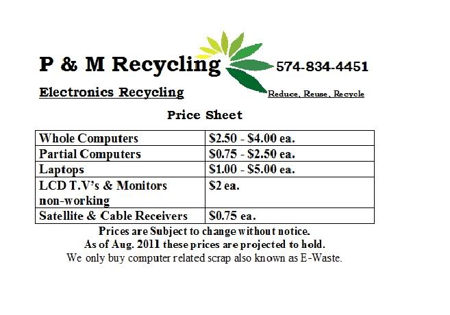
    Here's a little half sheet I used to hand out, I had a bigger one for computer stores. This one was for residential hand-outs.

    P & M Recycling - Specializing in E-Waste Recycling.
    If you enjoy your freedom, thank a vet.

  14. The Following User Says Thank You to Mechanic688 for This Post:


  15. #10
    SMF Badges of Honor


    Member since
    Feb 2012
    Location
    OK
    Posts
    5,731
    Thanks
    6,815
    Thanked 3,465 Times in 1,990 Posts
    I hardly even want CRTs anymore, even for free, but will accept one with a computer. The last ones I picked up just got dropped off at Goodwill on my way home


  16. Similar threads on the Scrap Metal Forum

    1. What do you guys think of my new business card design?
      By beedubz in forum General - Let's talk business
      Replies: 15
      Last Post: 05-20-2013, 09:56 PM
    2. Replies: 0
      Last Post: 05-11-2012, 07:21 PM
    3. What do you think of this flyer... before I print it.
      By Scrappy22 in forum Scrap Metal Tips and Advice
      Replies: 3
      Last Post: 10-26-2011, 09:28 PM

Thread Information

Users Browsing this Thread

There are currently 1 users browsing this thread. (0 members and 1 guests)

 
Browse the Most Recent Threads
On SMF In THIS CATEGORY.


OR

Bookmarks

Posting Permissions

  • You may not post new threads
  • You may not post replies
  • You may not post attachments
  • You may not edit your posts
  •  

The Scrap Metal Forum

    The Scrap Metal Forum is the #1 scrap metal recycling community in the world. Here we talk about the scrap metal business, making money, where we connect with other scrappers, scrap yards and more.

SMF on Facebook and Twitter

Twitter Facebook